Sunday, 27 February 2011

Project with Julia

This project was very challenging for me. The brief was set up by Julia studio http://www.julia.uk.com/en/

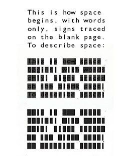
The brief was to randomly choose one font out of seven and then visually represent the most unique characteristic of the chosen font in an engaging way to as broad audience as possible. This project was collaboration with another student. We chose Courier New font and we found out that the most unique characteristic is being monospaced. Monospaced font is a font whose letters and characters each occupy the same amount of horizontal space.

On of the first and strongest was to monospaced a font which is not monospaced and compared to a font (Gill Sans) which is monospaced. For the visual aspect we used rectangles and letterpress technique to step out of the normal print. Even thought this idea was visually nice comparing font to another font is not a solution.

We lasercut sentence (typed in Courier new) and stuck the cut out letters on a board which would allowed us to print in letterpress.


monospaced non monospaced font (gill sans)
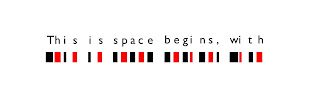

courier new
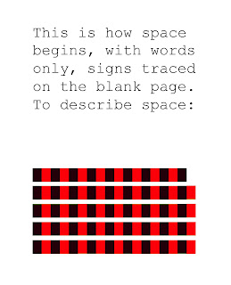
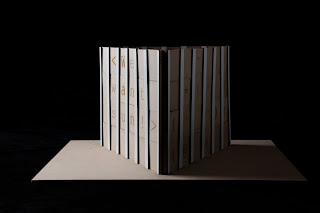
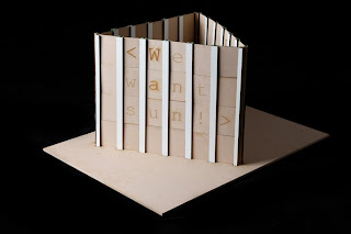
After going back to research we came up with a new idea which would also be engaging with any sort of audience. We cut a letters which would easily be sloth into he brackets to create different messages.


paper mock up

Wednesday, 23 February 2011

Devon clouds

I was driving through Devon when I noticed this beautifully shaped clouds..luckily I wasn't drving so could take some pictures.


Tuesday, 22 February 2011

Kanpyo Udon Gift Package & Paper Bag D&DA Awards 2010

For the branding for this new udon noodle product composed of gourd powder, the design needed to be both friendly enough to be recognised in one glance at the store, and high-class to compete with other traditional udon brands. I think this packaging successfully achieve this.


design Nosigner

Sunday, 20 February 2011

Pick & Mix Yumbers paper

Paper for pick and mix Yumbers sweets cone or a wrapping paper used in a sweet shop.


"U" for Unique

When I thought of a word unique an idea of designing an invitation cross my mind. I chose unusual shape, used wood instead of a paper and designed unique society logo. This unique invitation was to invite all unique people to a Ball.


Mouth

I wanted to achieve an effect where by looking through either red or blue colored plastic the layers of the picture separate also when looks through both colors the picture becomes 3D... So I screen printed first mouth (blueish) and then x ray of my teeth (red) over it. The outcome looks a bit weird but it works!


Saturday, 19 February 2011

Happy Days

Retro poster designed by me...

Wednesday, 16 February 2011

cool packaging


This is double Australia 2010

Taken with Mamiya (30yrs old) in Perth.....

Tuesday, 15 February 2011

Honey packaging

What a posh looking pot of honey ;o)...love the golden finish. This cool packaging has been made by Marcel Buerkle.


London research book

Sunday, 6 February 2011

Kinetica Art fair 2010

Today I went to Kinetica art fair which was absolutly amazing.
Kinetica Art Fair is produced by Kinetica Museum and is the first of its kind in the UK. It brings together galleries, art organisations and curatorial groups from around the world who focus on universal concepts and evolutionary processes though the convergence of kinetic, electronic, robotic, sound, light, time-based and multi-disciplinary new media art, science and technology.

Can't wait for Kinetica 2011 which will explore the evolution of the human body, brain, mind and consciousness.

">